Challenge
The problem
FlowPay’s dashboard was four years old and had not kept up with its users. A cluttered interface, confusing navigation, and a 7-step payment flow caused a 65% task abandonment rate, especially on mobile.
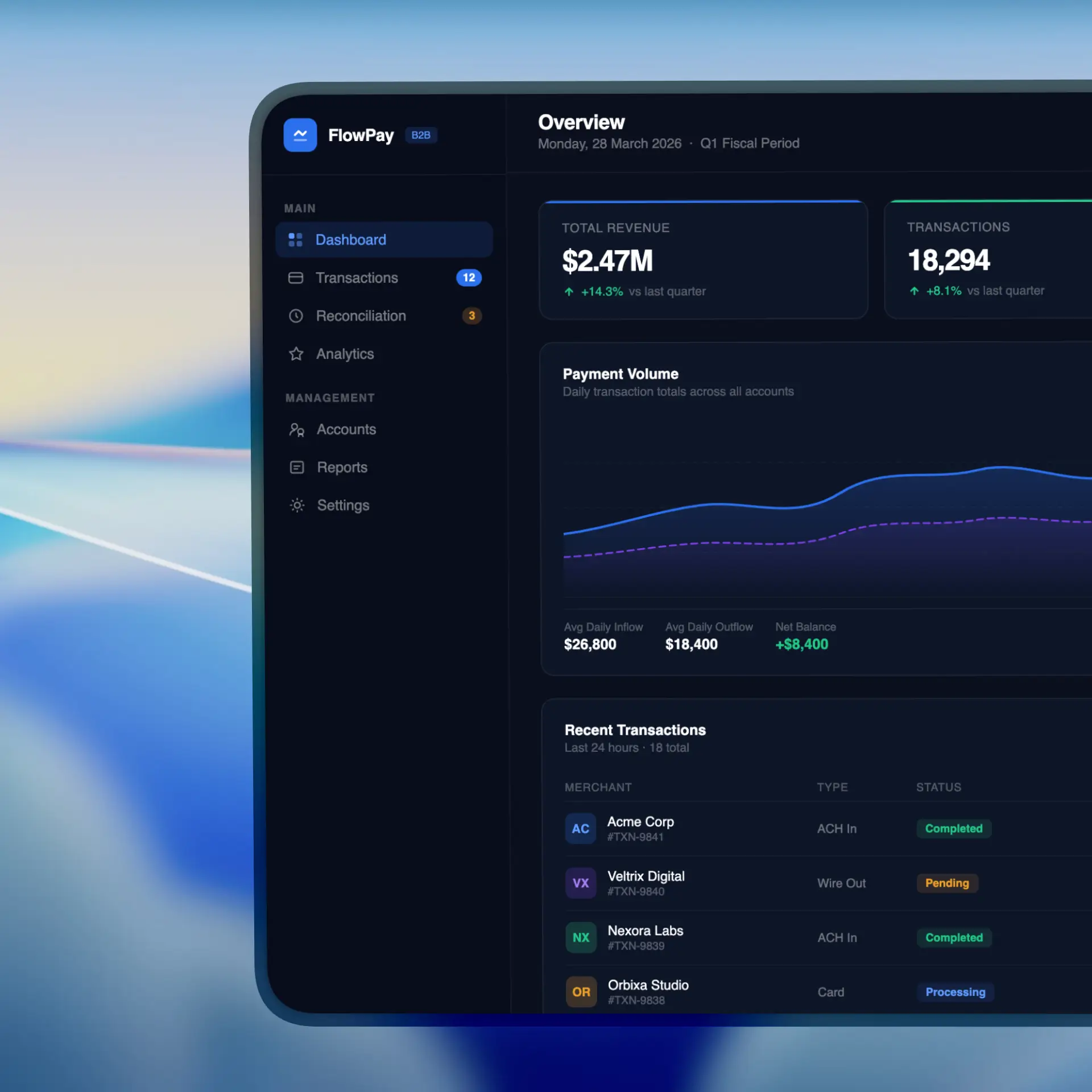
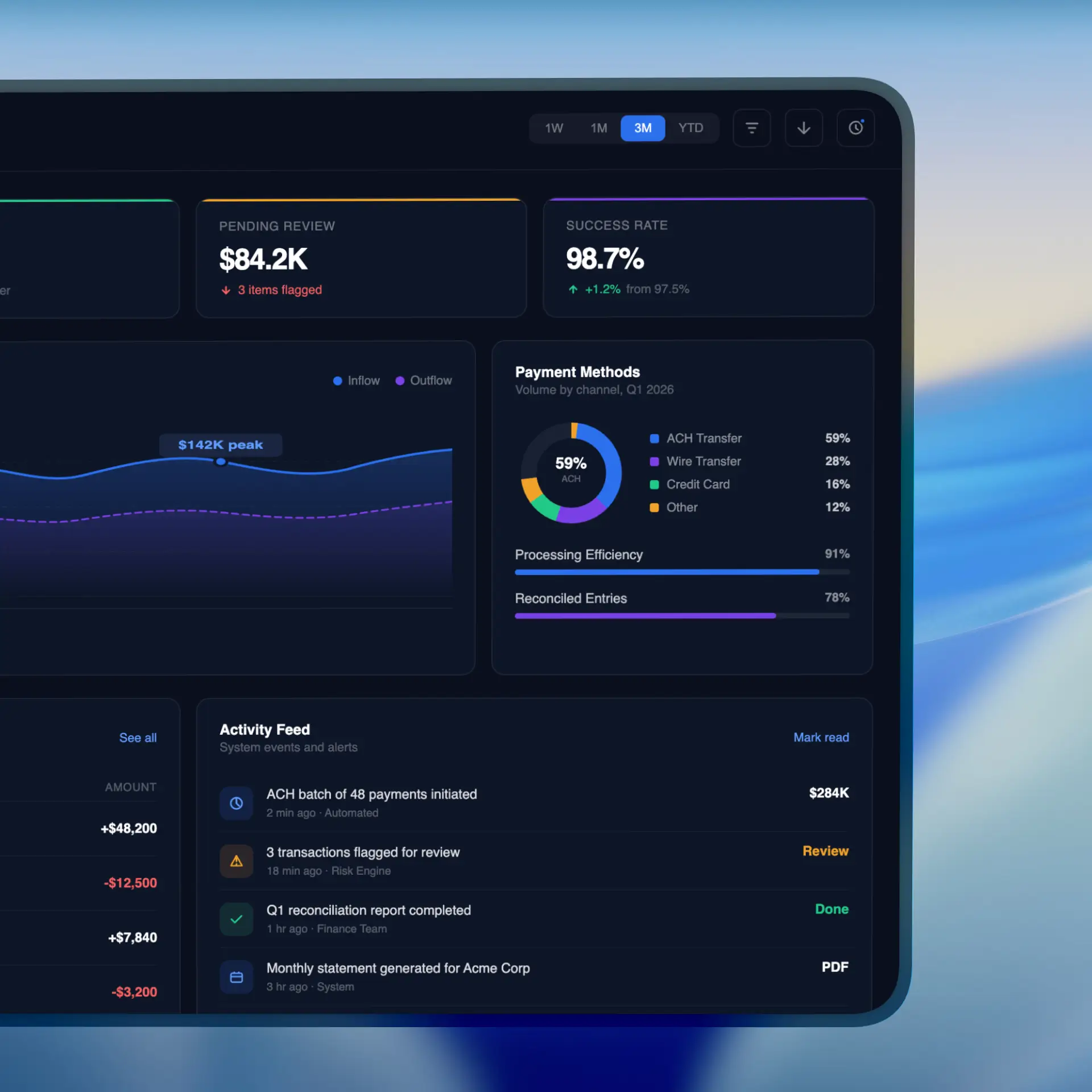
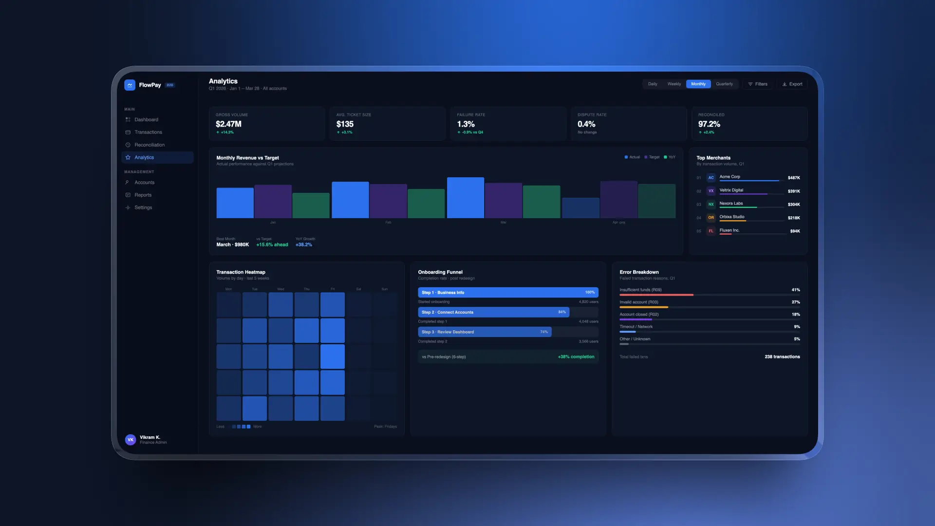
The goal was to redesign the full payment experience, from transaction management to reporting, so finance teams could pay with confidence.

Key pain points
70% of abandonments happened while creating a payment
Mobile tasks took 40% longer than on desktop
First-time users were 3x more likely to contact support
NPS dropped from 42 to 28 in one year
The problem
FlowPay’s dashboard was four years old and had not kept up with its users. A cluttered interface, confusing navigation, and a 7-step payment flow caused a 65% task abandonment rate, especially on mobile.
The goal was to redesign the full payment experience, from transaction management to reporting, so finance teams could pay with confidence.
Key pain points
70% of abandonments happened while creating a payment
Mobile tasks took 40% longer than on desktop
First-time users were 3x more likely to contact support
NPS dropped from 42 to 28 in one year
Process
Discovery & Research
I ran a 3-week research sprint combining interviews, analytics, and competitor reviews to understand user pain points and the business context.
Key findings
80% of users found payment options confusing.
A single payment took 4.2 minutes on average.
Finance teams could not find bulk payments.
Reports lacked real-time data, forcing manual exports.

Ideation & Information Architecture
I facilitated a 2-day design sprint with the cross-functional team, using crazy eights, mind mapping, and dot voting to generate and prioritize 120+ rough concepts.
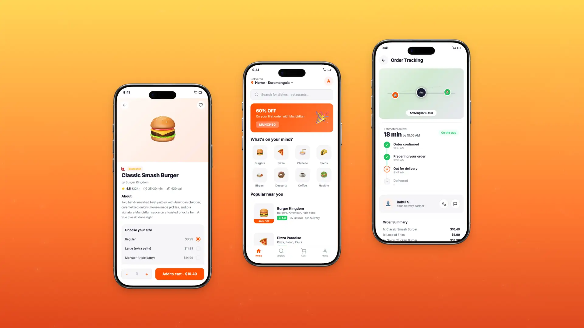
We chose StreamFlow, which turns payment creation into a guided, contextual experience instead of a rigid step-by-step form.

User Journey Mapping
I mapped the full journey from login to payment confirmation. The goal was reducing the flow from 7 steps to 3 while keeping every compliance and verification check.
Key journey
Enter payment details with smart defaults and auto-fill.
Review and confirm everything on one screen.
Track real-time status with an estimated processing time.
This journey shaped the guided flow and the new transaction dashboard.

Wireframing & Prototyping
I moved from wireframes to a high-fidelity Figma prototype and ran 4 rounds of usability testing with 24 participants, reaching a 95% task success rate.
Cutting payment fields from 5 to 3 made tasks 20% faster, and a single-column mobile layout with larger touch targets lifted mobile completion by 35%. Wireframes reached 92% task completion, up from 58%.
Discovery & Research
I ran a 3-week research sprint combining interviews, analytics, and competitor reviews to understand user pain points and the business context.
Key findings
80% of users found payment options confusing.
A single payment took 4.2 minutes on average.
Finance teams could not find bulk payments.
Reports lacked real-time data, forcing manual exports.
Ideation & Information Architecture
I facilitated a 2-day design sprint with the cross-functional team, using crazy eights, mind mapping, and dot voting to generate and prioritize 120+ rough concepts.
We chose StreamFlow, which turns payment creation into a guided, contextual experience instead of a rigid step-by-step form.
User Journey Mapping
I mapped the full journey from login to payment confirmation. The goal was reducing the flow from 7 steps to 3 while keeping every compliance and verification check.
Key journey
Enter payment details with smart defaults and auto-fill.
Review and confirm everything on one screen.
Track real-time status with an estimated processing time.
This journey shaped the guided flow and the new transaction dashboard.
Wireframing & Prototyping
I moved from wireframes to a high-fidelity Figma prototype and ran 4 rounds of usability testing with 24 participants, reaching a 95% task success rate.
Cutting payment fields from 5 to 3 made tasks 20% faster, and a single-column mobile layout with larger touch targets lifted mobile completion by 35%. Wireframes reached 92% task completion, up from 58%.
Outcome
Results
StreamFlow delivers a clean, confidence-inspiring payment experience on every device. NPS improved by 58%, onboarding drop-off fell by 25%, and support tickets dropped by 60% in the first month.
Key improvements
3-step guided payment flow
Real-time transaction tracking
Bulk payments for enterprise clients
Dark mode with WCAG AA compliance